Results 1 to 5 of 5

Thread: Which Headstock Decal to use?

  1. #1
    Hi Guys...I'm after some opinions on which decal design to use.

    I went ahead and printed the top design, but then got cold feet about it.
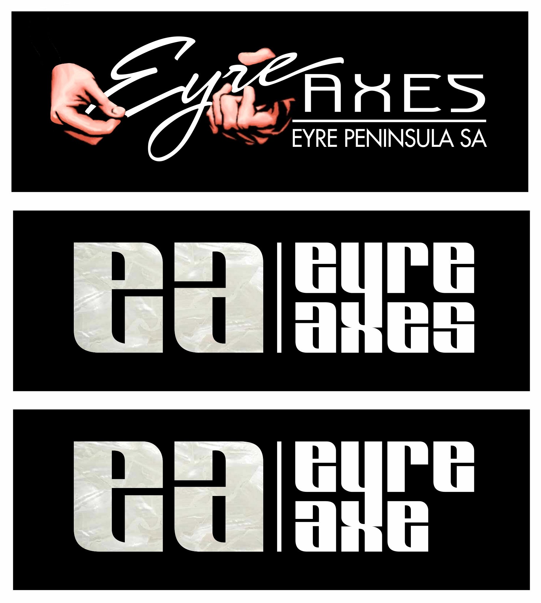
    Thinking that I have never seen graphics, eg. the hands, appear on a headstock. Only lettering.
    So yesterday I quickly knocked up a more modern one with lettering only, no graphic.
    They are to go on my LP-1 black headstock.

    How fussy can you get!!!!!
    Actually I think 'FASTIDIOUS' may be the word.


  2. #2
    I think the middle one is much more balanced.

    The first one is way to busy, but it might be really interesting to see what it looks like without the hands in it, and maybe even possibly without the "Eyre Peninsula SA".

    The bottom one feel top heavy.

  3. #3
    Mentor
    Join Date
    Jan 2013
    Location
    Talawa, Tasmania
    Posts
    1,173
    I'm with phloggy- the middle one is best.

    Maybe save the top one for promotional material, as the idea is excellent.

    I'm also glad you resisted the temptation of the pun "Eyre Guitar"....
    "Music is in the air; it's my job to pull it out."- Jaco Pastorius

  4. #4
    Thanks phloggy and bass guy...the middle one it is!!
    Just printed it, will apply it tomorrow.

    Yeah, the top design is the signwriter coming out in me...
    ...definately more of a sign than a headstock decal.
    The name Eyre Guitar is actually already in use.

    Thanks
    Andy

  5. #5
    Top one is a great graphic but would look best on a t-shirt I reckon, so I agree on the middle one too. When I was designing a name/logo for my Telecaster I also had some over complicated thing going on but realised (like you did) that just about every guitar name/logo out there is quite simple and needs to be easily read from a few feet away.

Posting Permissions

  • You may not post new threads
  • You may not post replies
  • You may not post attachments
  • You may not edit your posts
  •