
I got a little bit of age on you DB but i still remain very active.


I got a little bit of age on you DB but i still remain very active.

I don't it was over half a century agoOriginally Posted by tonyw


The new photos are going up. Looks like we'll average about 5 per week, it's a time consuming process. At over 100 kits this may take 6 months.
I'm really happy with the results so far (except of course that my Brother is showing me up!)
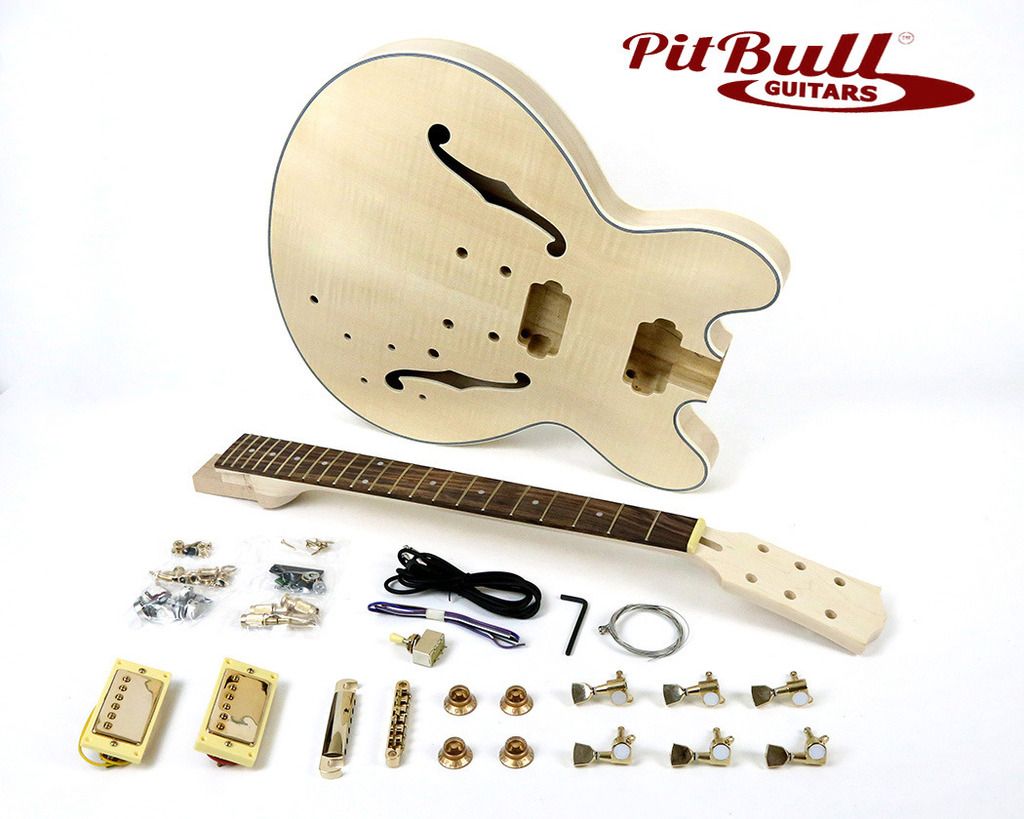
Here's the ES-1G... check out how good the "gold" hardware looks at the front.
The new pics will have our logo in the top right corner.
Mark doesn't like the logo in the shot, but I think that may be coming from the Photographer's perspective (ruining the great shot and all that). What do you think? Keep it? Lose it?
From a business perspective, it will show up in searches and reinforce our "brand" as visitors browse our site. From an aesthetic POV I can see Mark's point.
What do you think?
Cheers,
Adam
adamboyle(at)pitbullguitars.com

I'd keep it because if people save the pic and share it , it becomes a business card. You could always give it some perspective in Photoshop
DittoDid way too ...oh never mind
Adam,
All I did here was keep the top in line with the top of the frame and pulled the right hand end down so it followed the line of the neck a bit more.
Thanks Deadman, interesting perspective (get it, "perspective"? hello?? *crickets* nevermind)
Cheers,
Adam
adamboyle(at)pitbullguitars.com
*tish boom*

I'm with dedman the logo needs to stay, so if someone searches google images for guitar kits they will get a well presented image with the pitbull logo on it, and upon further searching they will end up here.
As a Photographer with a business brain, I strongly believe the logo needs to stay.
Make sure that the images are tagged with the correct SEO info so they show up on google and image searches and you have a very good brand building strategy.
 Posting Permissions

 Reply With Quote